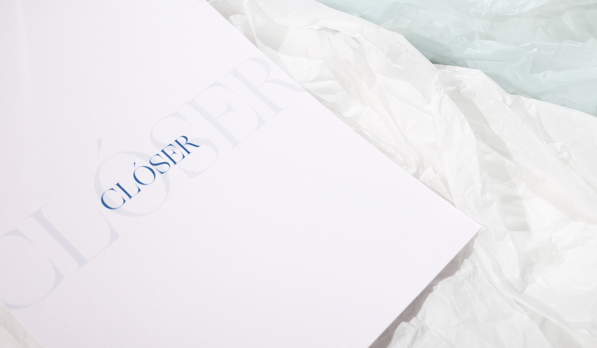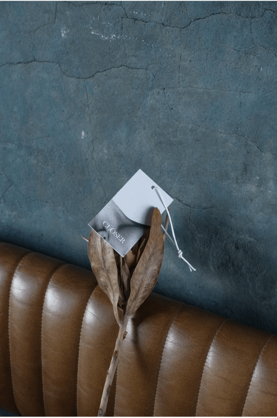
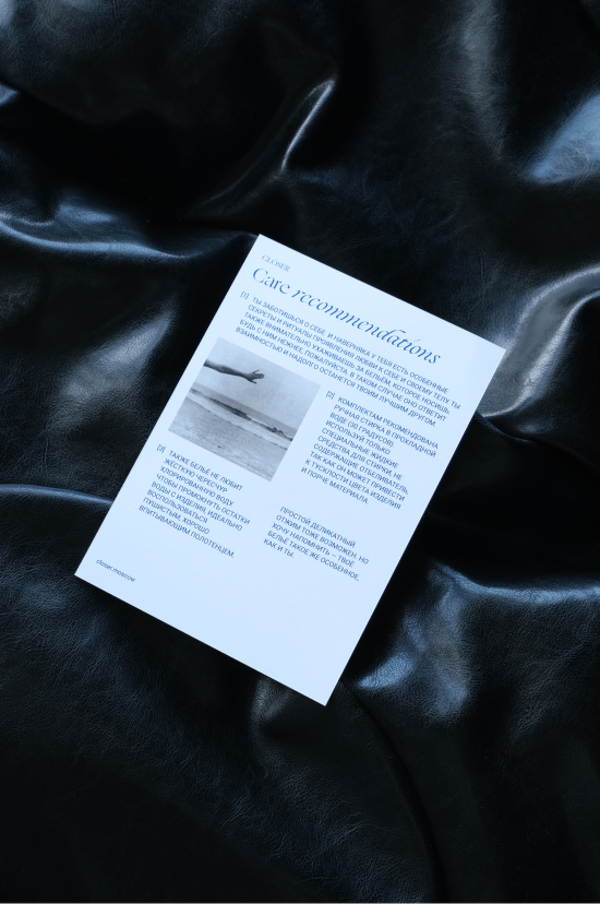
Clóser
iii
v
lxxx
Айдентика для бренда нижнего белья Clóser
2021
2021
/проект
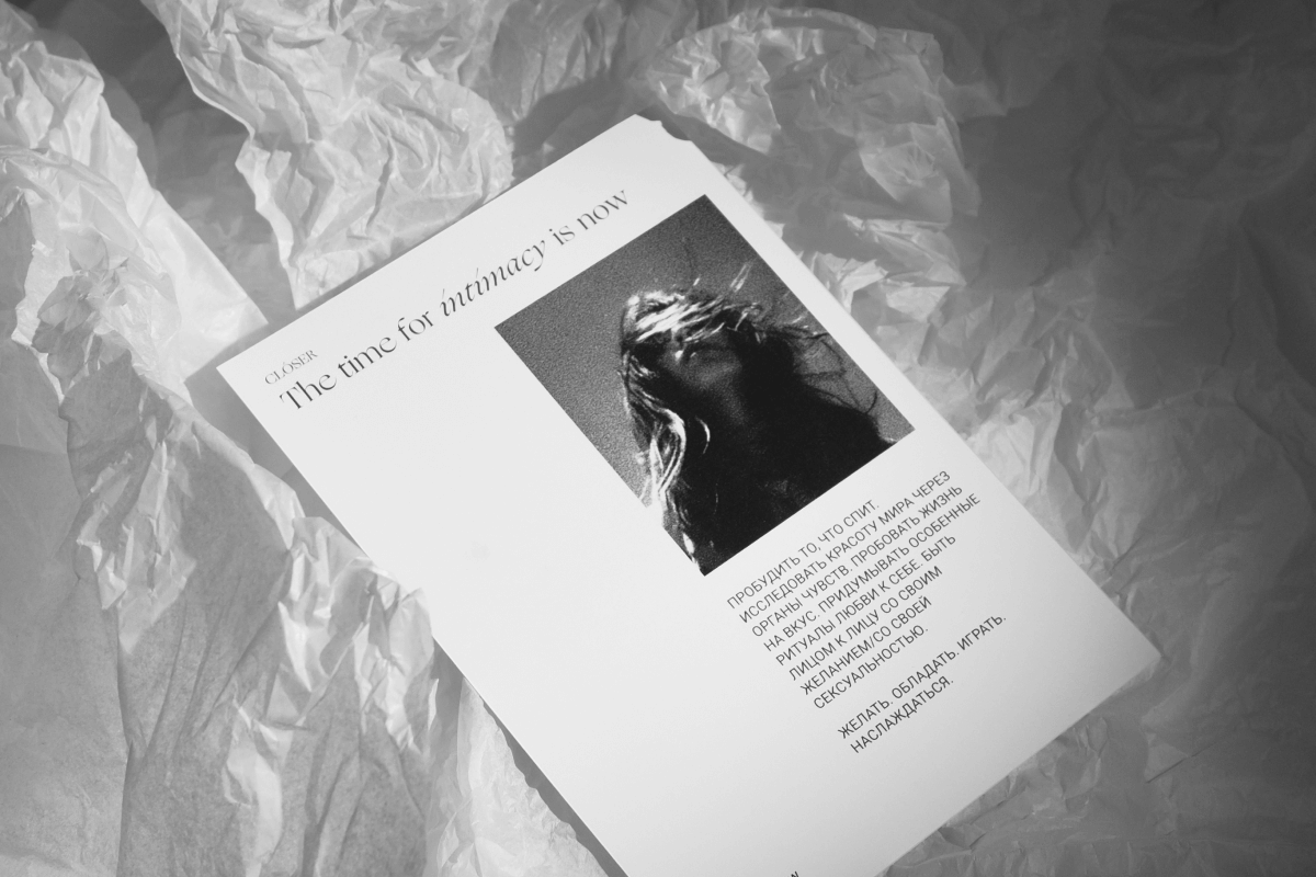
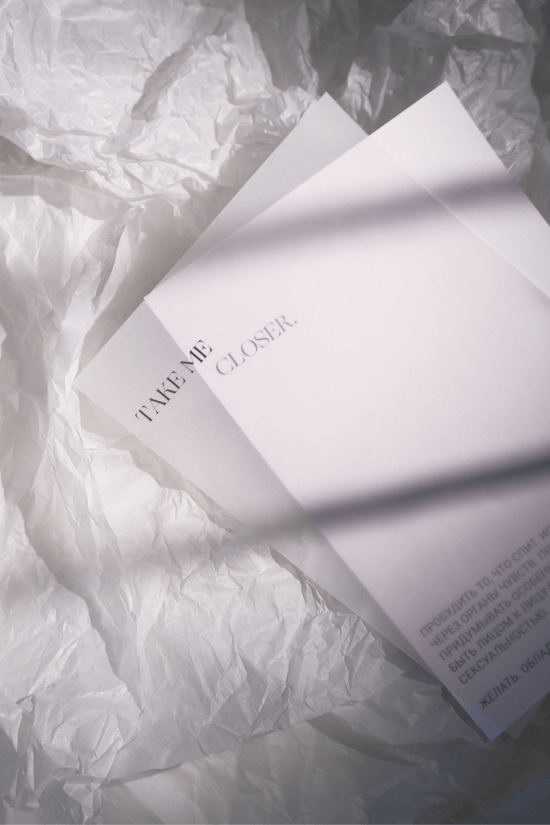
МАНИФЕСТ БРЕНДА: «Познавать мир с помощью чувств. Пробовать жизнь на вкус. Пробуждать то, что спит. Придумывать ритуалы любви к себе, заботиться о себе. Быть лицом к лицу со своими желаниями. Играть и наслаждаться».
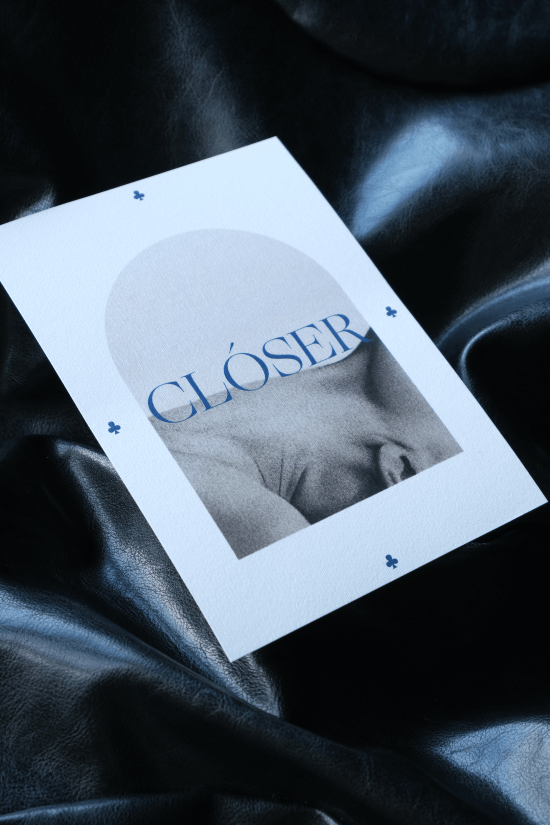
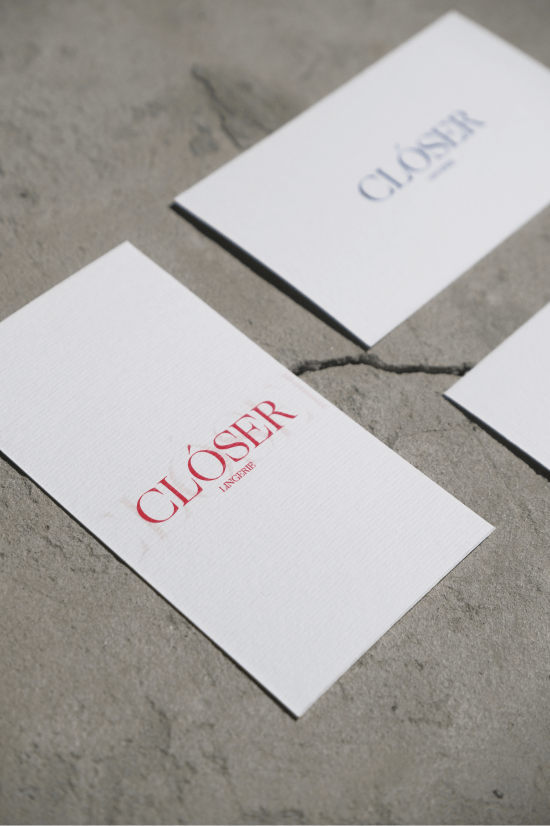
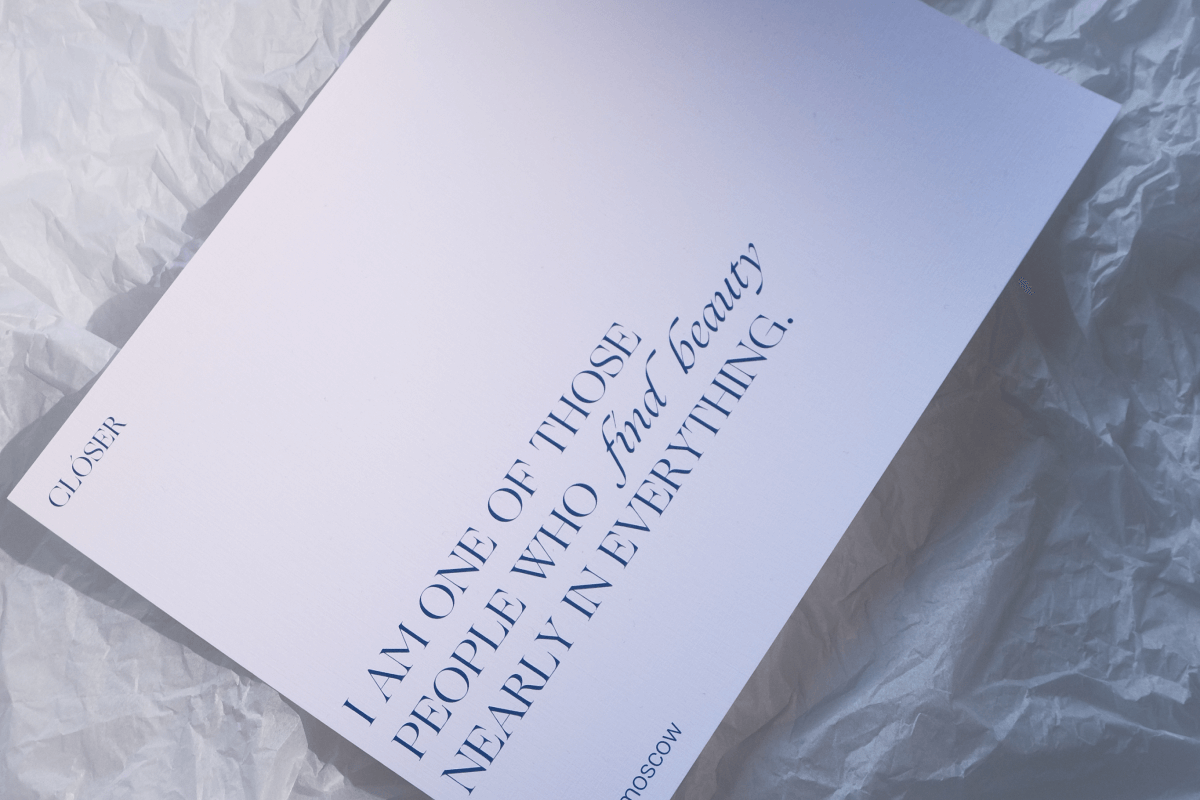
ЦветА рассказываЮт историю. Глубокий синий — безмятежностЬ, дыханиЕ, полночЬ. Кроваво-красный — ЖизненнАЯ силА, пульс.
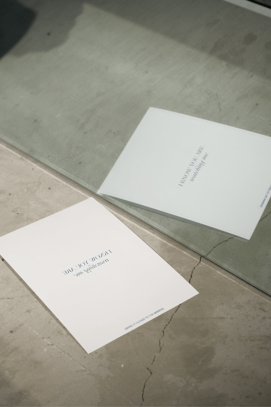
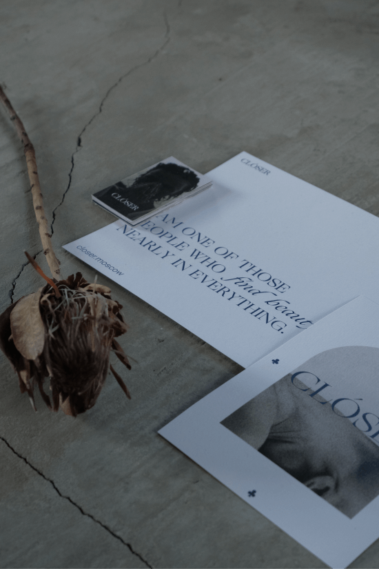
Типографика вдохновлена древними формами — баланс классической элегантности и современной ясности. Отсылка к Таро. Взгляд в сторону сакрального.
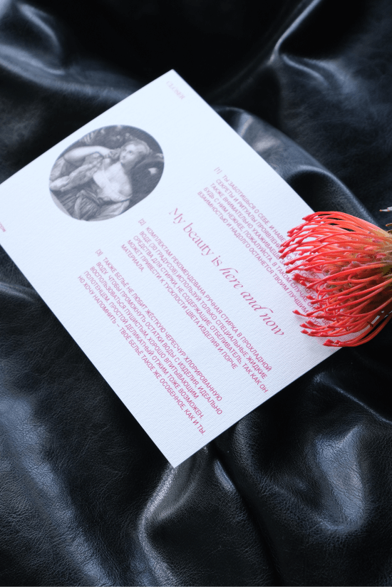
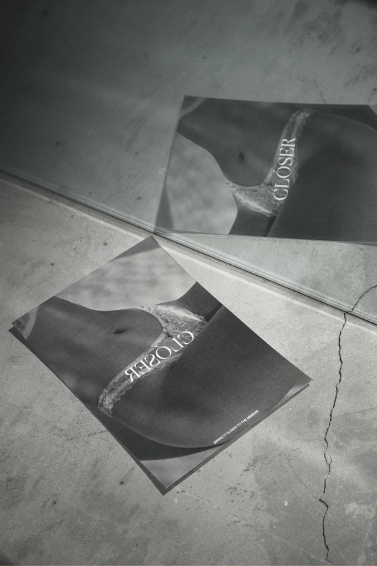
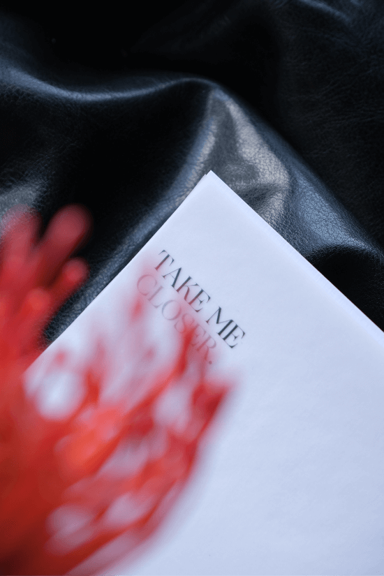
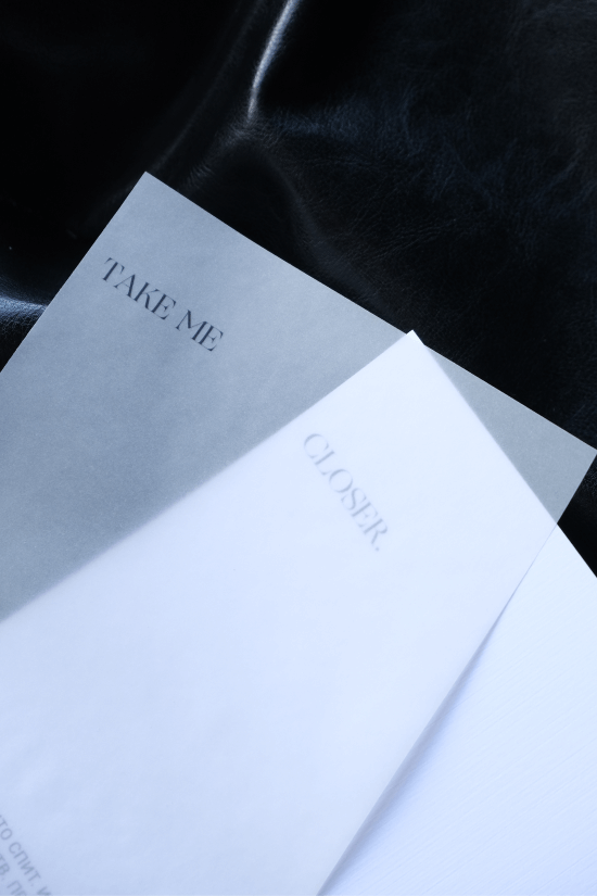
МАТЕРИАЛЫ — Полупрозрачные обложки, Грубый картон, Зеркальные вставки. Каждый элемент приглашает к паузе, размышлениям, близости.
Типографика вдохновлена древними формами — баланс классической элегантности и современной ясности. Отсылка к Таро. Взгляд в сторону сакрального.
МАТЕРИАЛЫ — Полупрозрачные обложки, Грубый картон, Зеркальные вставки. Каждый элемент приглашает к паузе, размышлениям, близости.